
版权归作者所有,转载请注明出处

凭记忆画出著名品牌标志
Famous logos drawn from memory
凭记忆画出著名品牌标志
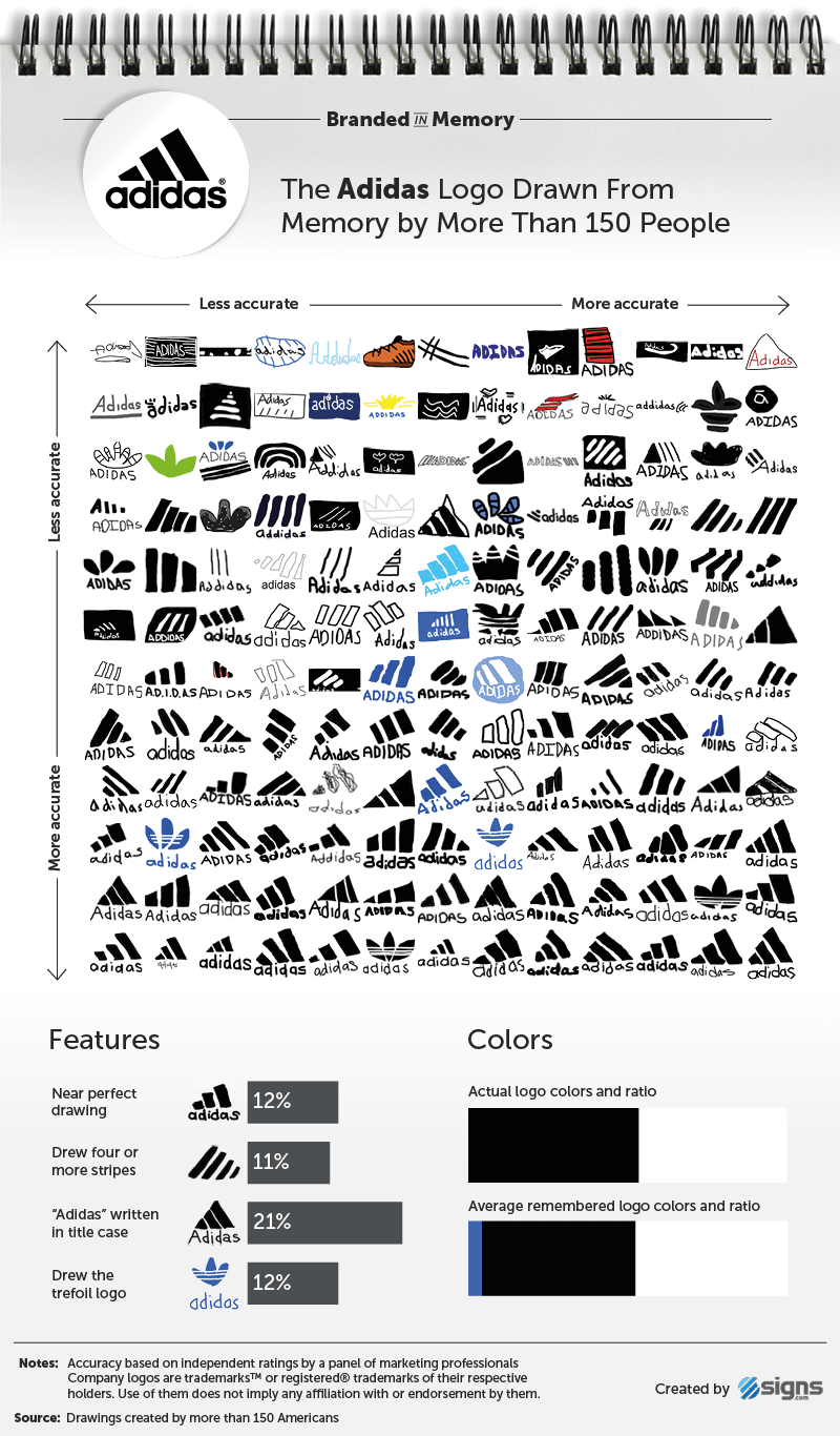
156 Americans between the ages of 20 and 70 were given half an hour to draw 10 well-known logos from memory, uncovering how well we remember the features and colours of the symbols that surround us.
在20到70岁之间的156名美国人,在半小时内凭记忆画出10个知名的标志,揭示了我们如何记住周围符号的特征和颜色。
Top-left is least accurate, and bottom-right pretty much spot on.
左上角是最不准确的,右下角的位置是最接近的。
 Adidas logo drawn from memory
凭记忆画的阿迪达斯标志
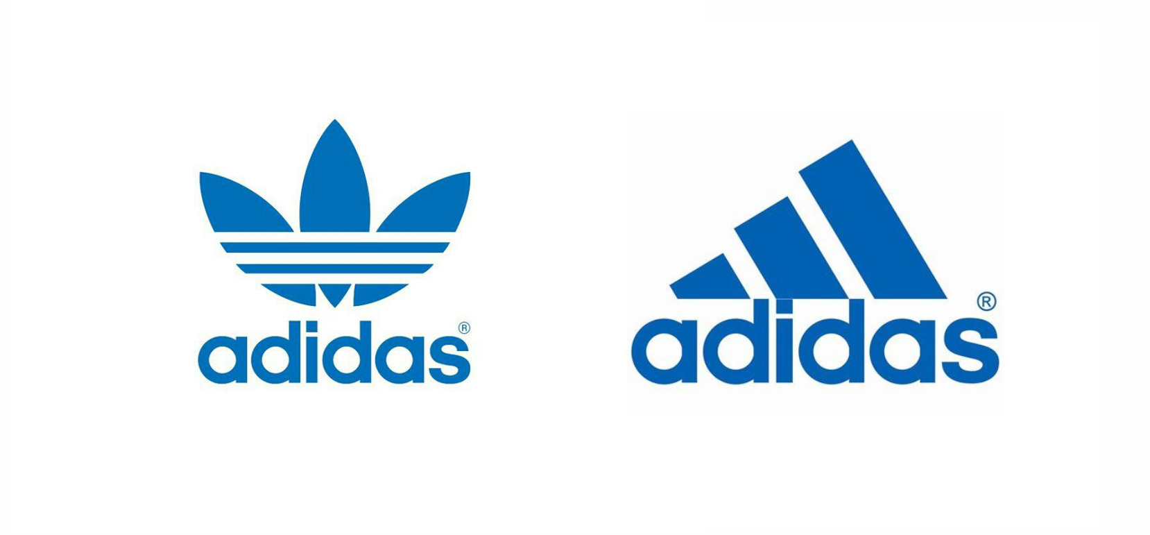
阿迪达斯官方标志
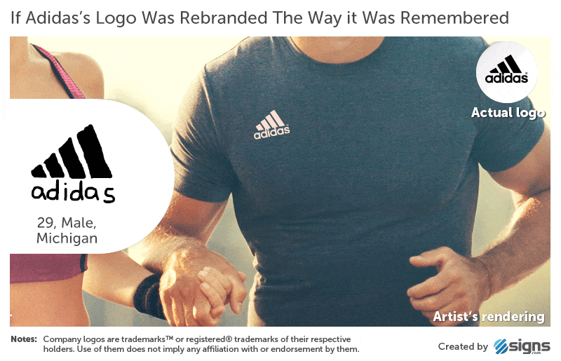
以记忆中样子重制的LOGO效果

Burger King logo drawn from memory
汉堡王标志
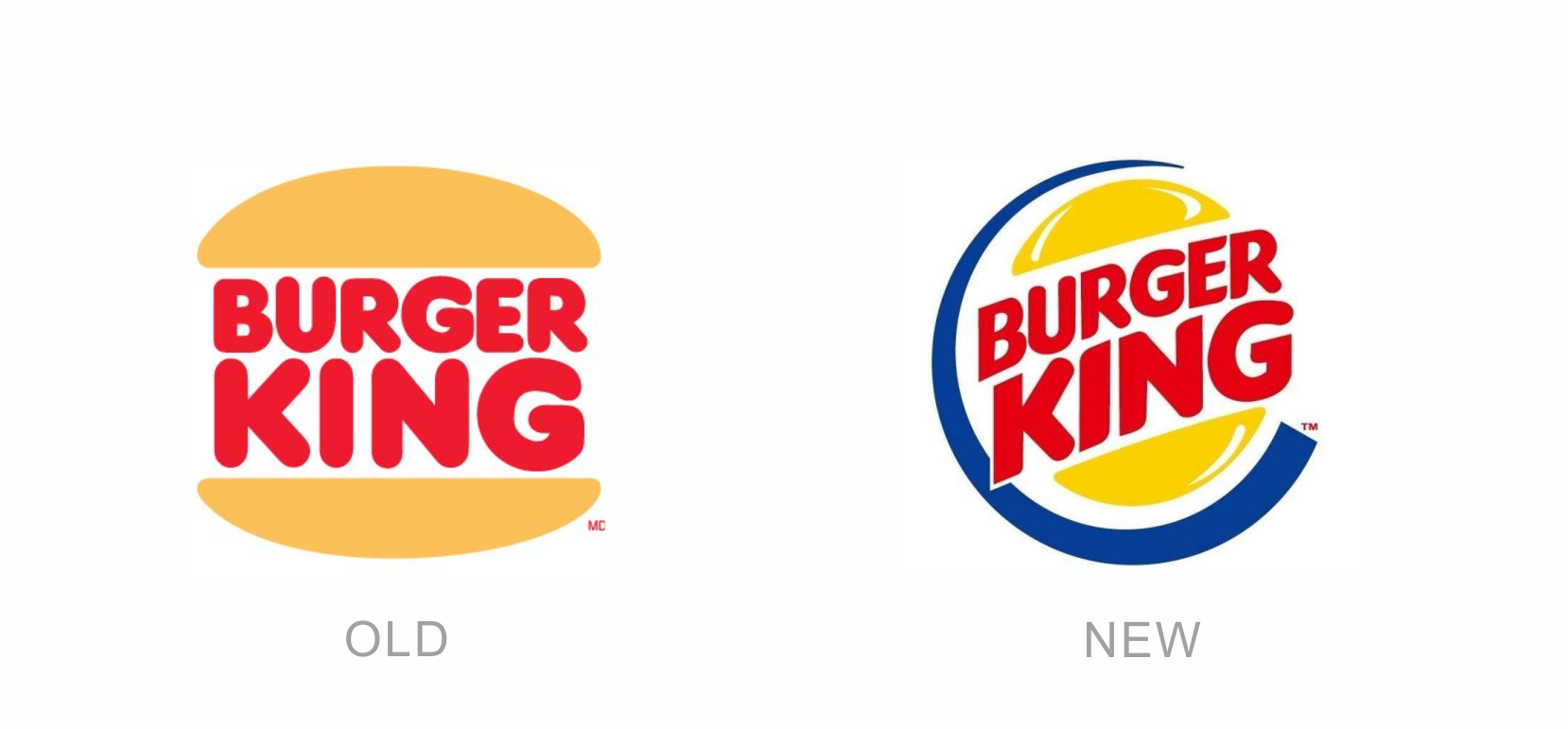
汉堡王官方标志
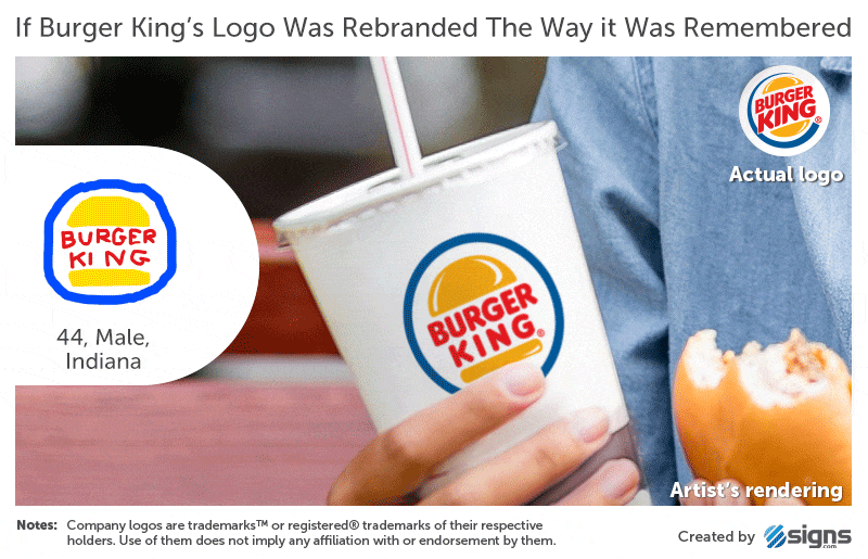
以记忆中样子重制的LOGO效果
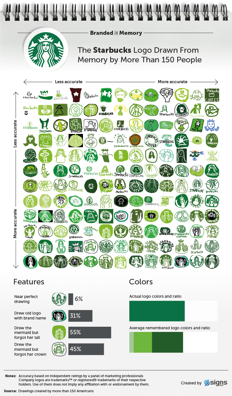
Starbucks logo drawn from memory
星巴克咖啡标志

星巴克咖啡官方标志
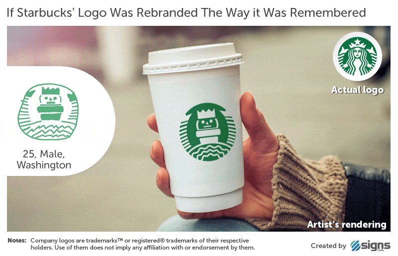
以记忆中样子重制的LOGO效果
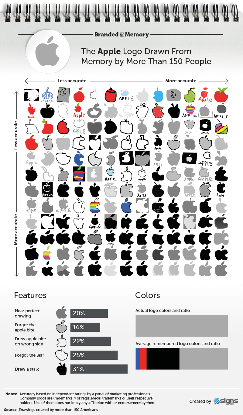
Apple logo drawn from memory
凭记忆画的苹果标志

苹果官方标志
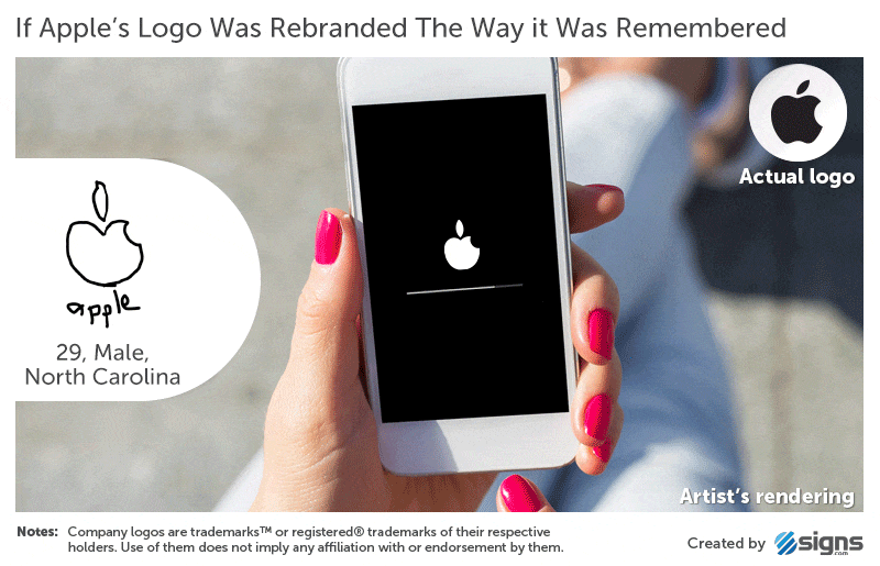
以记忆中样子重制的LOGO效果
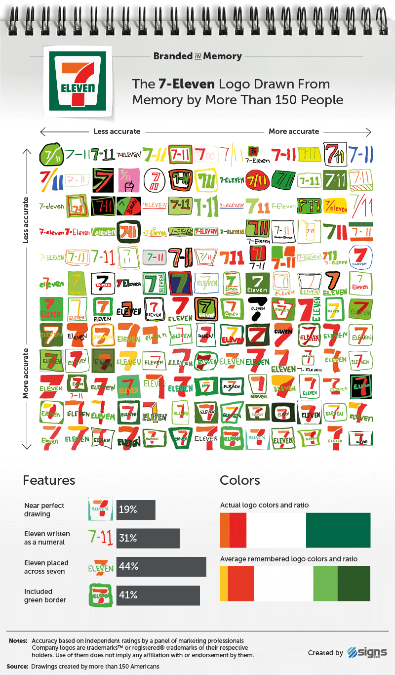
7-eleven logo drawn from memory
凭记忆画的7-11标志
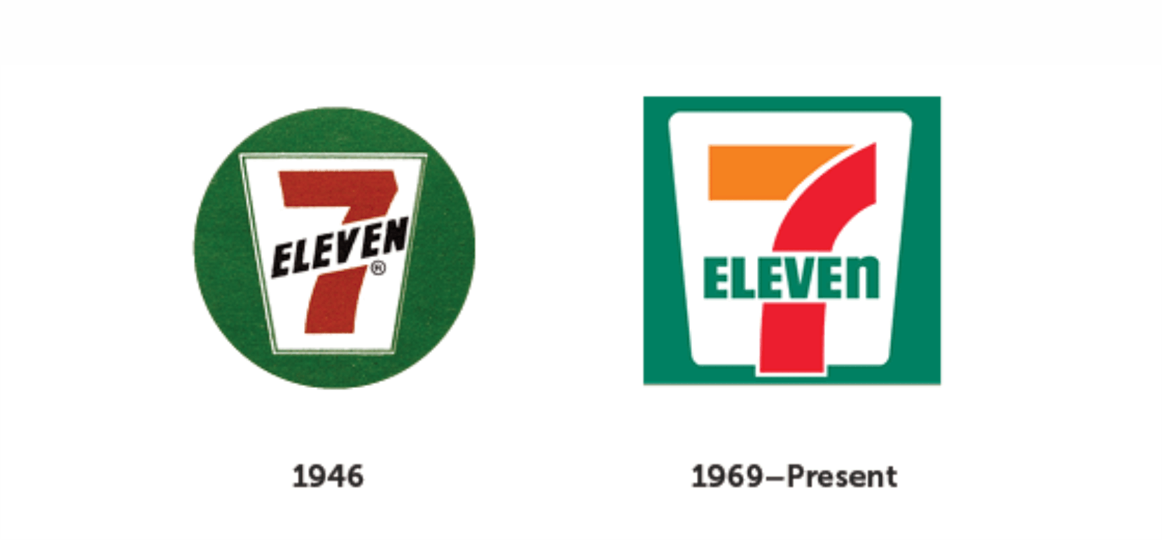
7-11官方标志
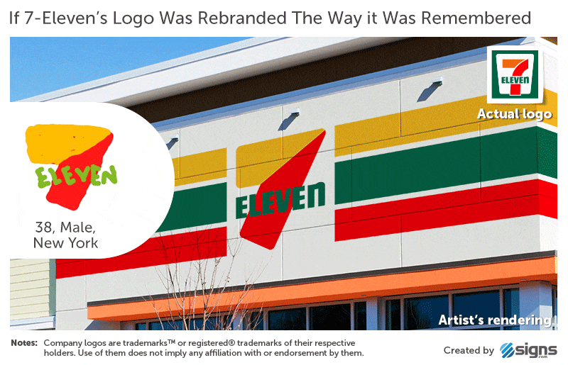
以记忆中样子重制的LOGO效果
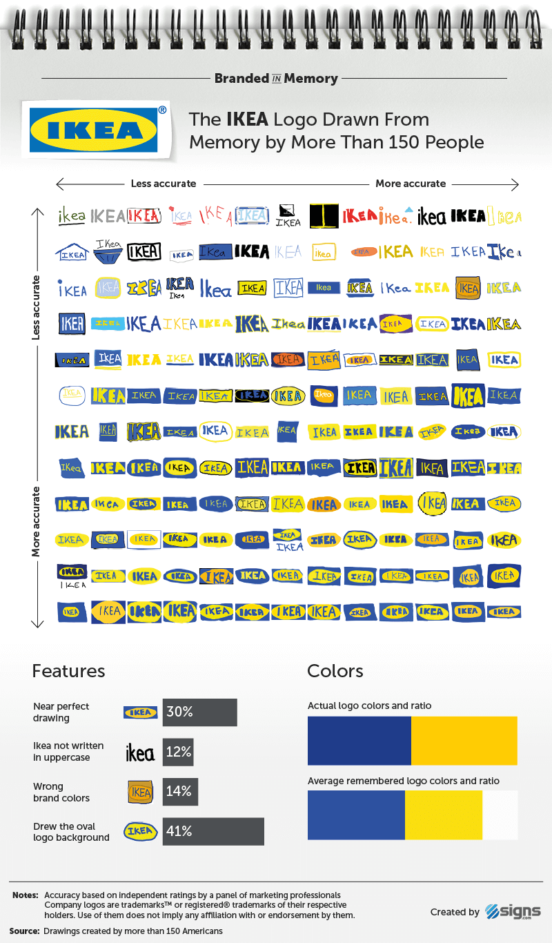
IKEA logo drawn from memory
凭记忆画的宜家标志
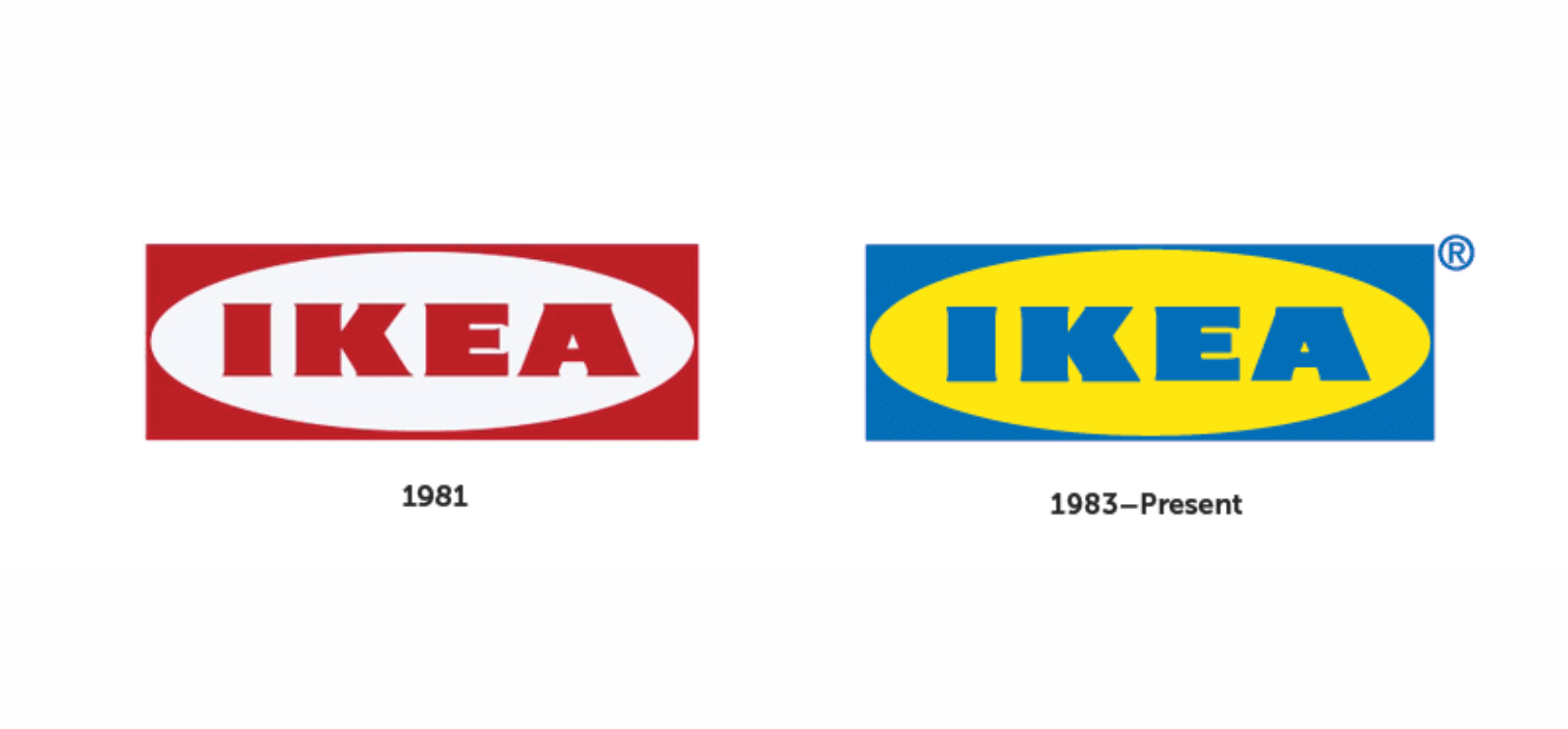 宜家官方标志
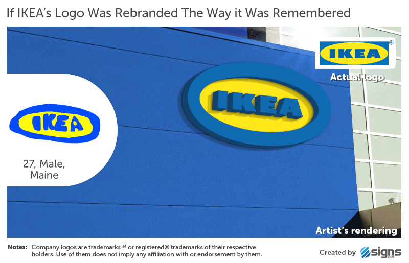
以记忆中样子重制的LOGO效果
选了几个国内比较熟悉的品牌,其余感兴趣的可以自己去Signs.com查看。
Aside from the fact that there surely must’ve been a few graphic designers among the 156 participants, you’ll hardly be surprised that the logos with the most accurate recreations across the board, i.e., from top left to bottom right, are those with the simplest appearance (Target rather than Starbucks).
除了156位参与者当中,肯定会有几位平面设计师的事实,您几乎不会感到惊讶的是,所有这些手绘的标志从左上角到右下角,是最简到精确的过度。
What’s obvious from the results is that most people are excellent at recalling brand colours — around 80 percent selected the correct palettes for their drawings, while shapes proved harder to recall. This highlights how beneficial it can be to assign logos with colours that are clearly different from competitors. Of course, it’s much easier to reach consensus on an unusual colour when working on a new design rather than something with existing brand equity (sometimes it’s more important to stick with what’s already in place).
结果显而易见,大多数人都非常喜欢品牌颜色 - 大约80%的人选择了正确的颜色来绘制标志,而形状被证明难以回想起来。这突出显示了如何使用与竞争对手明显不同的颜色设计标志。当然,在设计新品牌而不是现有的品牌(有时候更重要的是坚持已有的设计),对于不同寻常的颜色达成共识要容易得多。
While the study conducted was small, it kind of highlights the logo design challenge — to create a mark that can be easily remembered, while distinctive enough to stand out from the competition.
尽管所进行的研究很少,但它突出了标志设计的挑战 - 创造一个可以轻松记住的标志,同时具有足够的突出竞争优势。
原文参考:
https://www.logodesignlove.com/famous-logos-drawn-memory
https://www.signs.com/branded-in-memory/#article-header


